Columbia & The Weather Channel
Partnership
Responsibilities:
Creative & Client Management, Art Direction, Design (Concept - Completion), Cross-Department Collaboration, Vendor Relations, Budget Management, Compliance Coordination
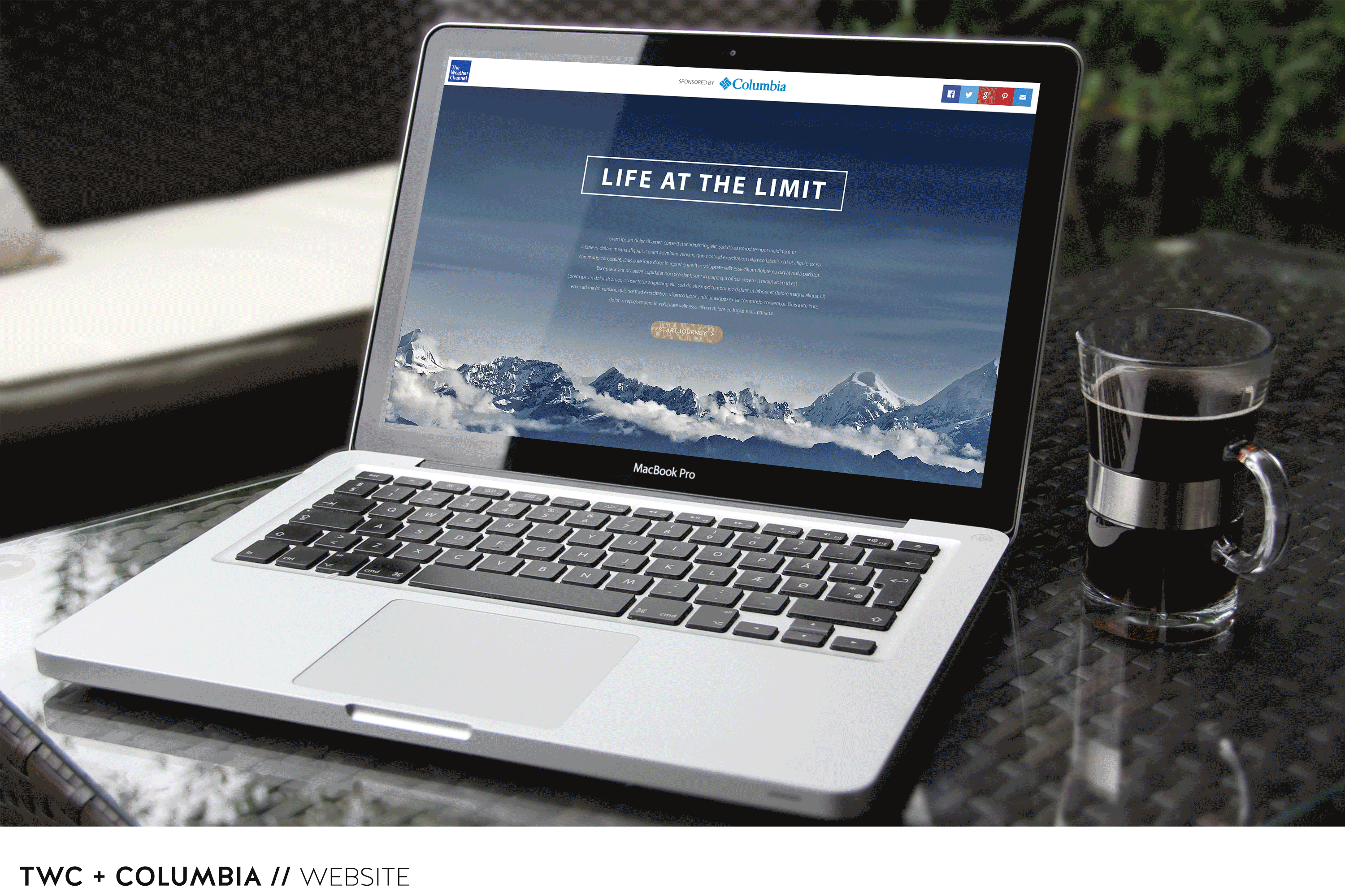
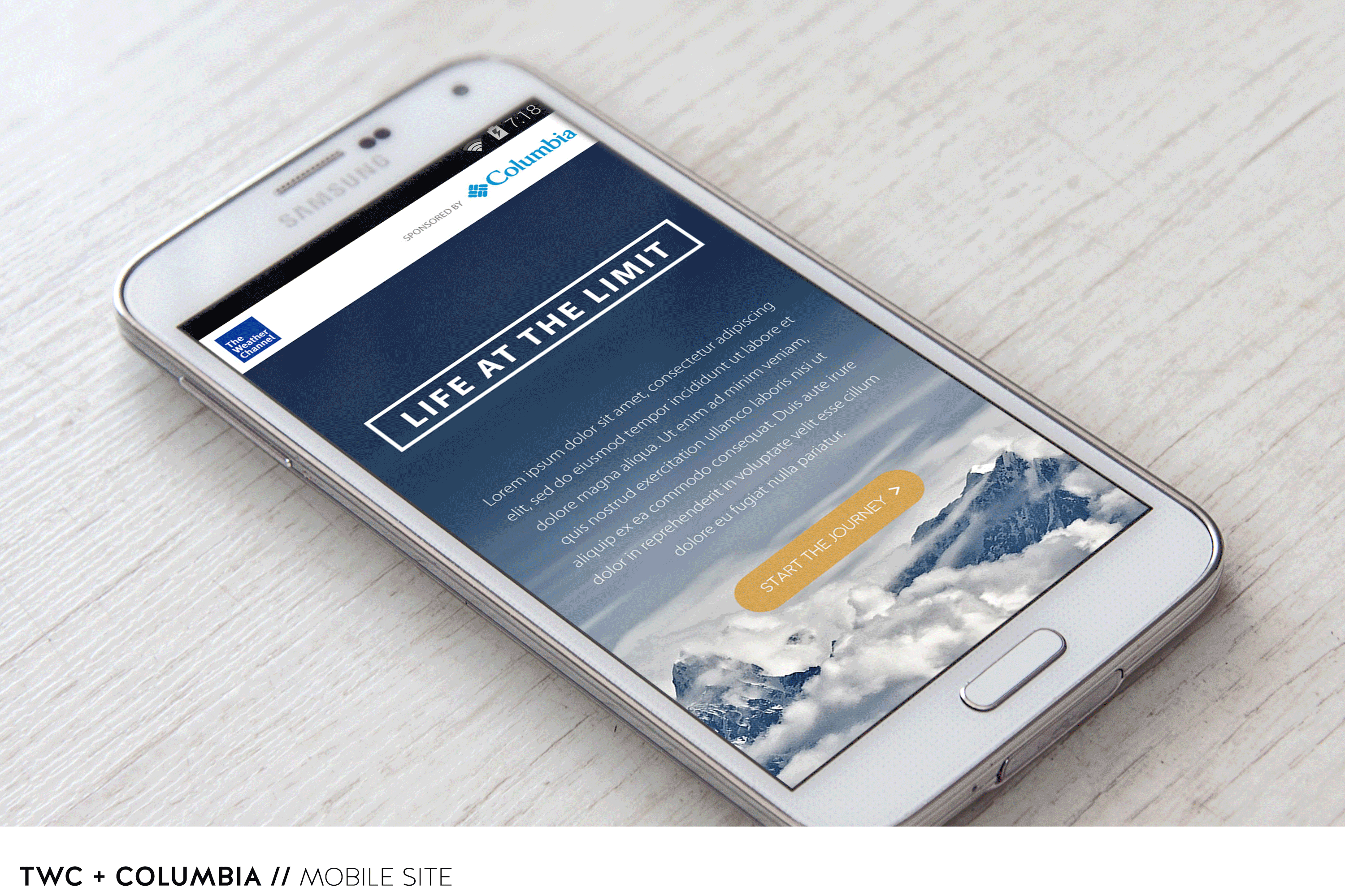
Project: Weather Content Website & Mobile Site on Weather.com
Goal: Create a successful content site with the ability to be sponsored by different advertisers. Use Toyota's content website and mobile site to create a custom experience for Columbia Sportswear
Research: We completed some initial background research for the content site we created for The Weather Channel's Epic Earth partnership with Toyota. We learned we would need to appeal to the weather enthusiasts in order for a content website to be successful with ads.
We also found that the majority of the weather enthusiasts don’t particularly like the busy nature of weather.com or the abundance of intrusive non-relevant ads, for example 1-800 Call Me. They are more attracted to a simplistic story-telling with big visuals, interesting locations, factual weather content, and are ok with a few interesting and relevant ads.
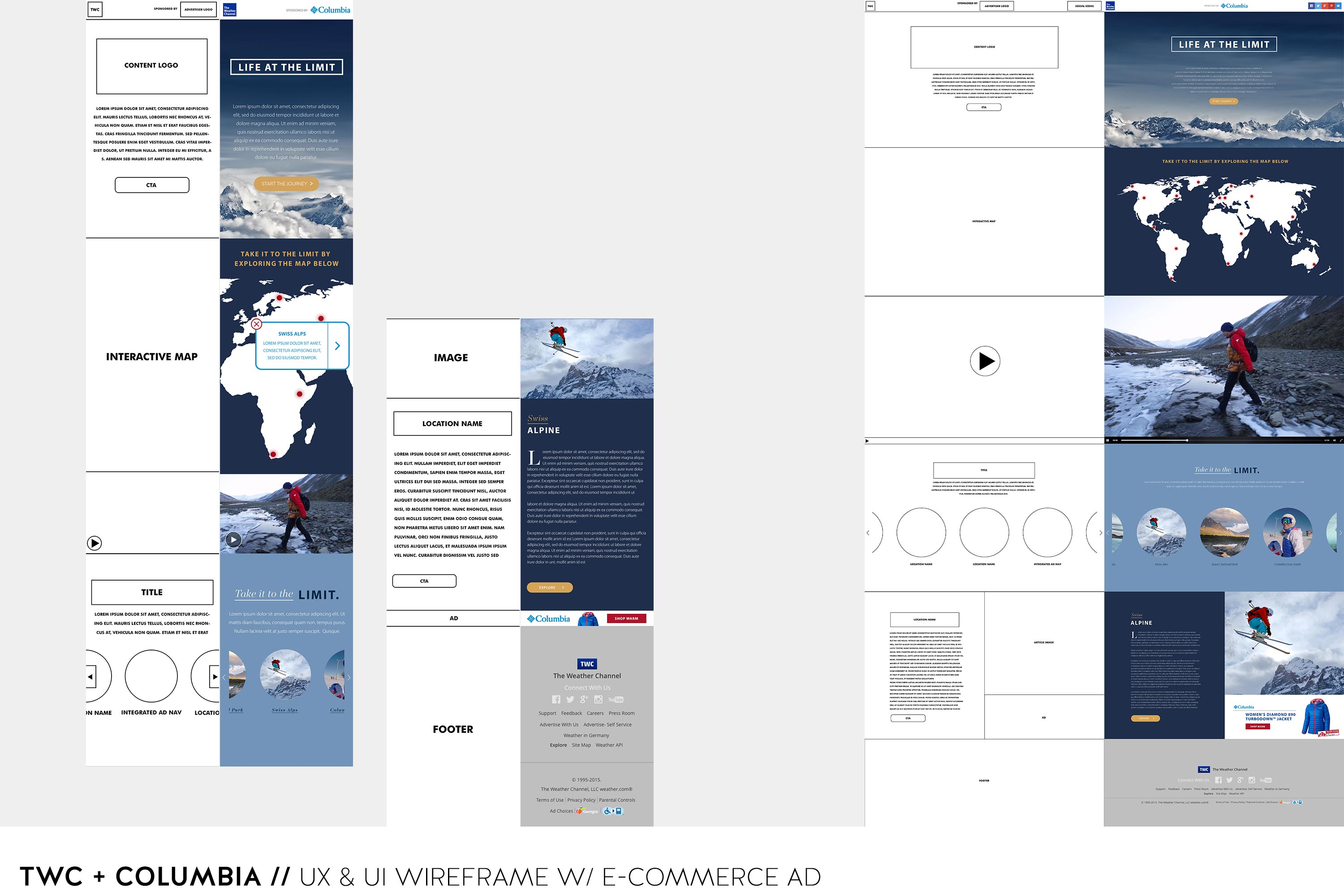
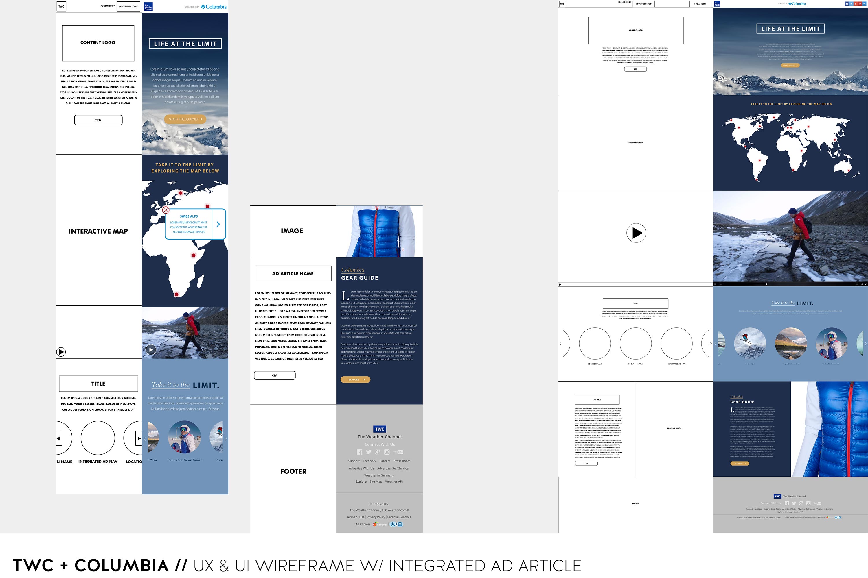
As we began laying out the user experience, we worked to make sure the layout was actionable, simple, and had strong visual space for the content while integrating space for advertisements. Ultimately, we went with a one-page web and mobile site design with navigation that takes you down the page. With the TWC's Life At The Limit partnership with Columbia Sportswear we decided to alter the ad experience to be a little more integrated than the Toyota site. The layout is bulleted below.
Initial page:
Sticky header - TWC logo, Advertiser Logo, Social Media Icons
Big Background visual with logo, article description, and CTA that leads you to the interactive map
Interactive Map:
Contains exotic locations that are clickable and will lead you to the specific article page
Advertiser Video:
If the user decides to scroll past the interactive map, they will land on the advertiser video next. The video autoplays after a few seconds and is relevant to the content. For example, the website is about exploring exciting locations and living on the edge. Columbia’s campaign is all about being prepared and comfortable for those situations. The video will only autoplay once. The user will have to initiate the video after.
Article Nav:
If the user scrolled past the interactive map and video…no worries. We incorporated an Article Nav page that will take the user to the article of their choosing. We also integrated a content ad article into the nav. The nav moves right and left as the user uses the arrows on the sides like a carousel effect.
Article Page:
Article Page starts with a default. If user clicks on a location on the map or an article nav button, the appropriate article will appear in that space. The sponsored integrated ad page consists of a header, promotional and educational content, CTA, and a big visual image of the product. The non-sponsored article page consists of a header, content, CTA, big visual image with an e-commerce ad displaying a product that is relatable to the article. For example, the article is about the Swiss Alps and the ad is about having the appropriate clothing for that particular climate at that specific time. The CTA could lead to various pages like an outside article or video. It can also send you back to the article nav (most common).
Footer:
We decided to remove the IAB standard ad that we used with Toyota because we felt the impact of the ads incorporated gave a strong user experience. The footer is necessary in order to be compliant with company policy.
Once we had a pretty solid idea on the user experience and layout, we focused on the user interface. We chose a cool color palette with a mix of bold and subtle colors that push the bold colors forward in an elegant way and kept the graphics fairly clean to make sure we captured the simplistic nature the user likes to experience and be on par with Columbia's brand. The interactive map was designed to relate to Columbia’s adventurous audience. The font choice is a mix of serif and san-serif fonts adding a nice contrast for the logo, headers, and content. We incorporated subtle animation throughout the site to create interest and entertain the user. For example, the nav circles are nested short videos and cinemagraphs.
Ultimately, we felt this execution is a nice marriage of content and relatable advertising, giving the users a wonderful and unique experience as well as Columbia Sportswear's products and brand.