Role
Led UX innovation for a Fortune 500 media and telecom’s customer mobile app, revolutionizing the customer’s shopping and support experience through human-centered design. Through extensive field research and stakeholder collaboration, delivered innovative solutions that brought a shopping and support experience to a traditional account management app. Key innovations include design system components, intuitive mobile shopping and support interface, accessibility, and personalization. Additionally, on-boarded and mentored supporting designers from abroad.
Account, Shop, + Support
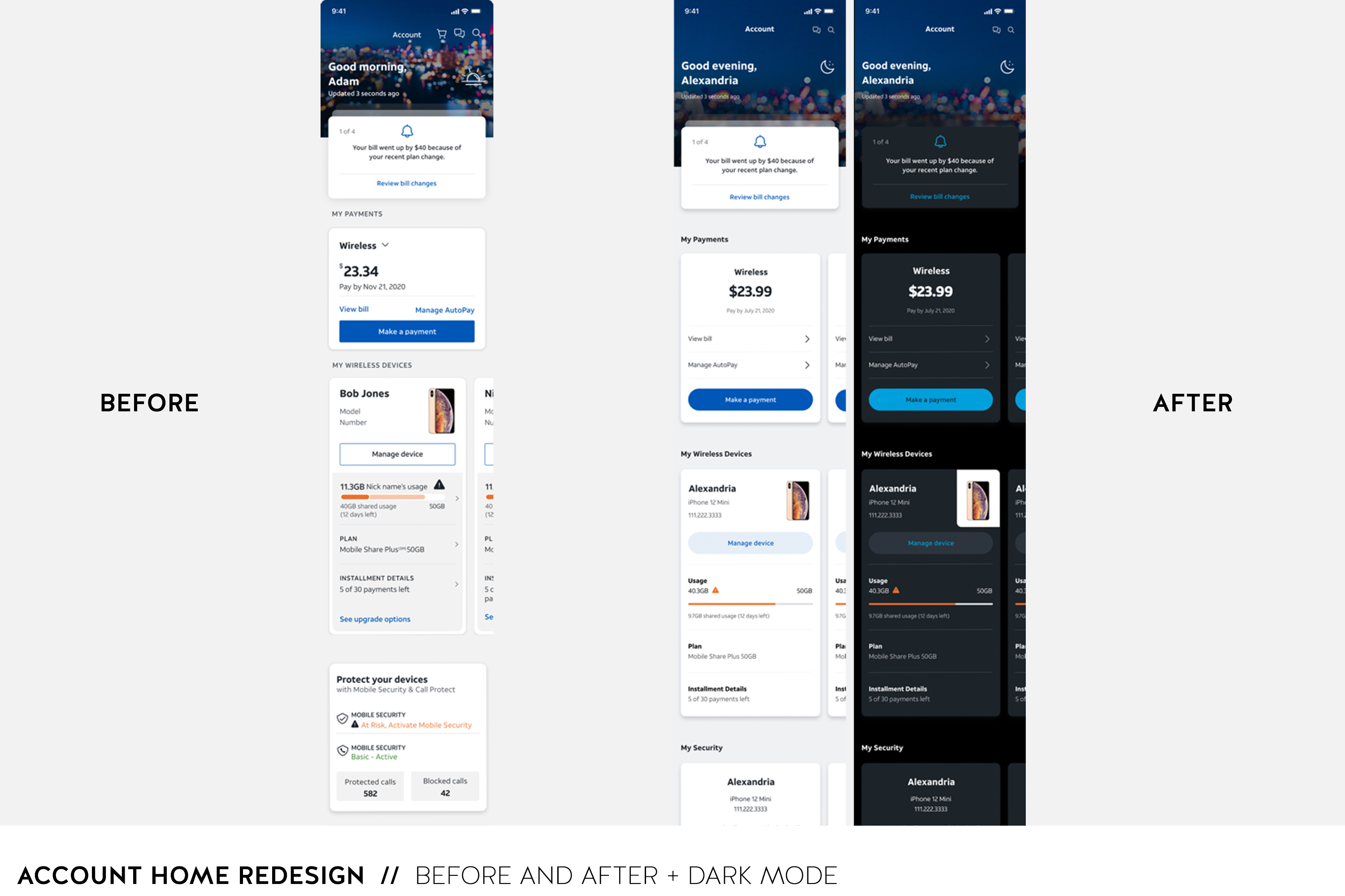
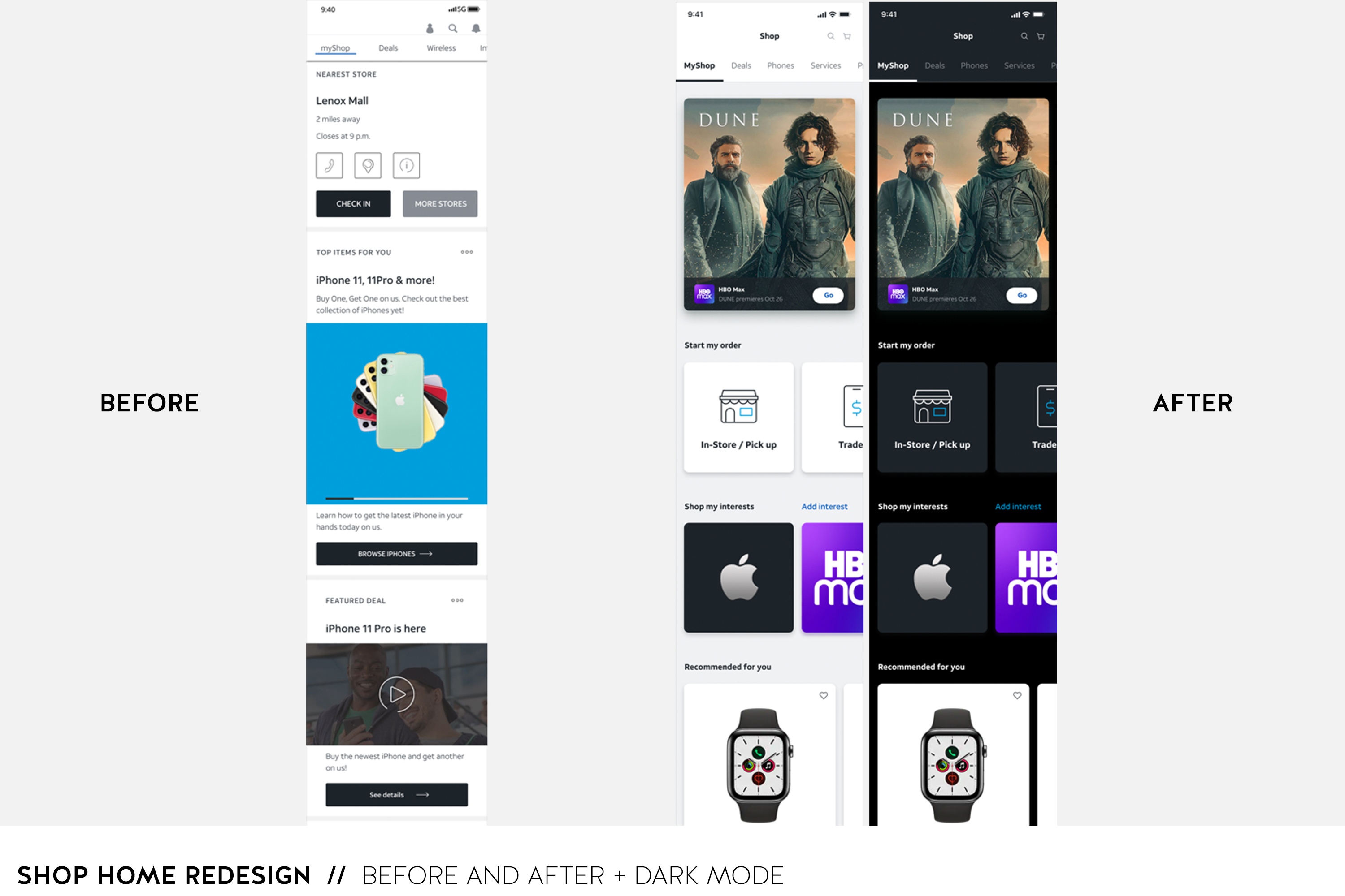
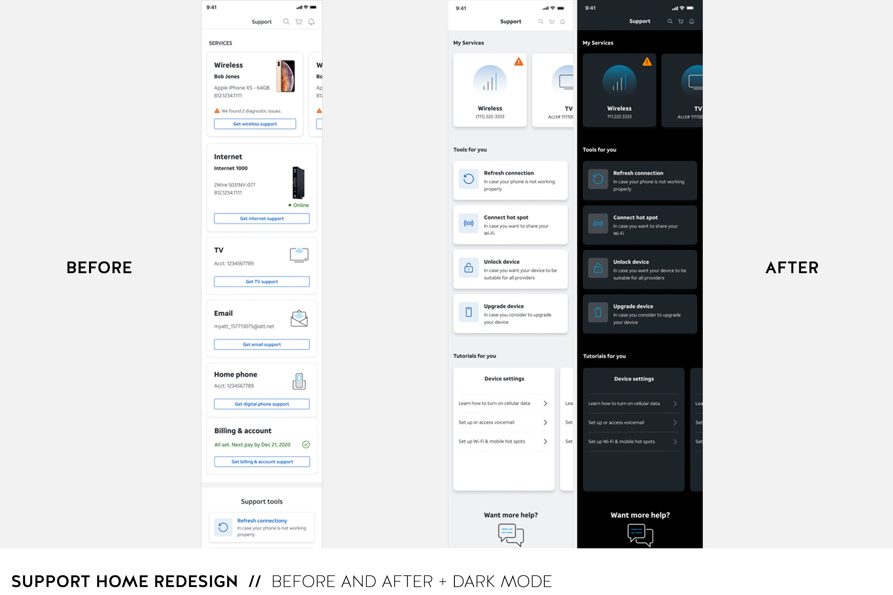
Project Details: Took a look at existing experiences and broke down the information architecture with the thought of what would the user want to see first and what information would be helpful. How can we come across as an assistant for them in the shopping, support, and account experiences. Fortunately, we had done quite a bit of testing prior to this assignment to reach this level of experience. However, I hope they continue to test and understand their users as everything evolves.
Once I had the information architecture in a good place, I was also tasked with exploring the visual design and uplift the design from the previous execution. Examples of the visual design and flow are below. I had done quite a bit of research of other brands as well study the design system we already had which wasn't as app friendly as I had hoped. With mobile apps, people know you can tap and swipe. They are learned actions that are now normal. With that in mind, I went about creating a system of tappable cards.
Deals Feature
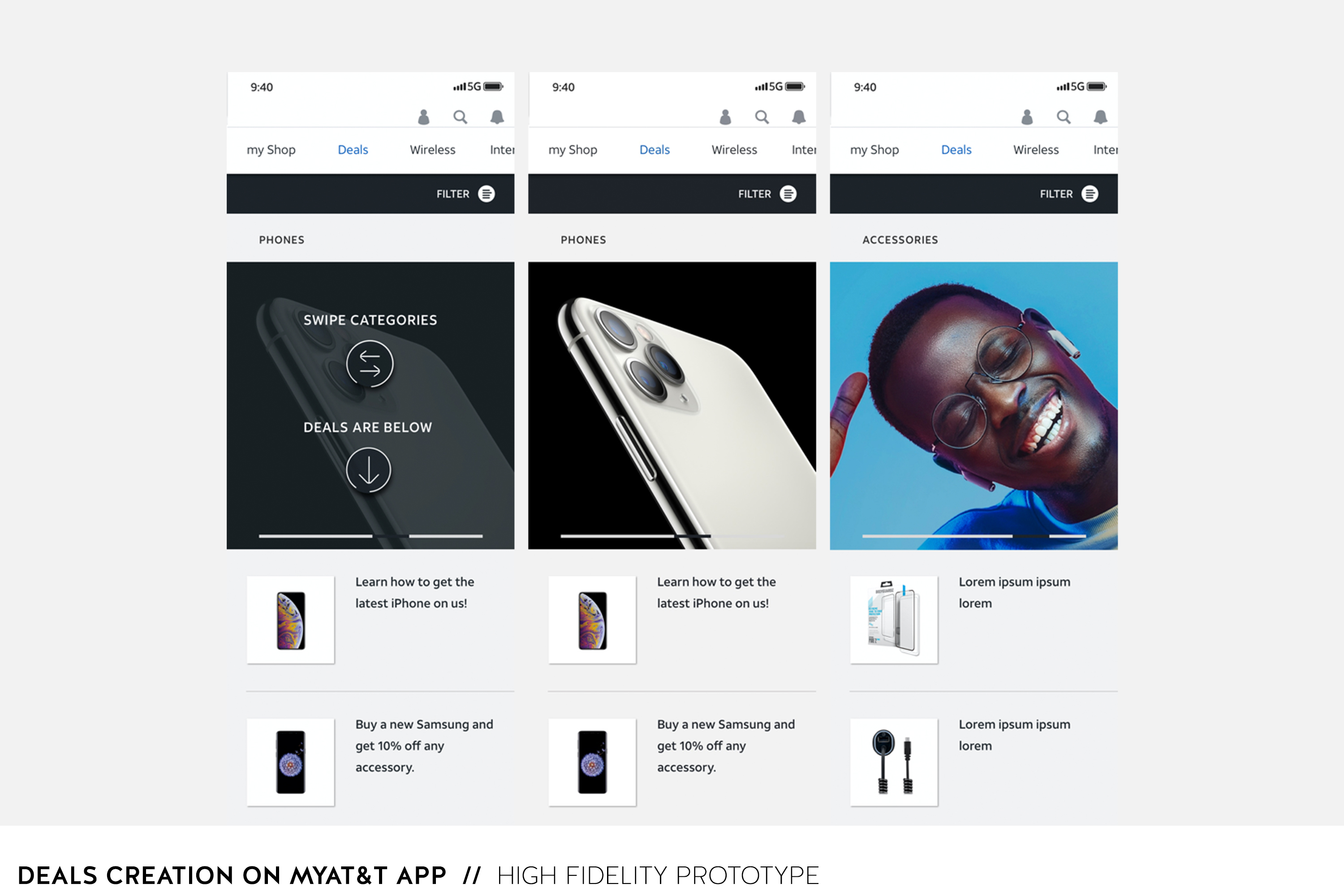
Project Details: This is a part of the app that was created from scratch. I did a lot of mobile app research and I stumbled upon a Target experience that showed a catalog at the top and then all the deals in the catalog below. I was like that is a great way to keep things organized and not take the user to another page. At AT&T, they have so many categories like phones, internet, tv, etc. With the Target execution in mind, I wireframed what that kind of execution might look like with all the information AT&T is trying to put forward. Through that process, it became obvious that this could be pushed further and we could potentially put promo videos in the category block, for example an Apple release video which we thought could be a great experience for the user who enjoys that content. After putting the wireframe together, I created the high fidelity prototype and we tested the experience. We got great feedback. With this being a new kind of experience, some of the users felt it might be helpful to display a how to use graphic but once they knew how to use it, they liked it a lot.
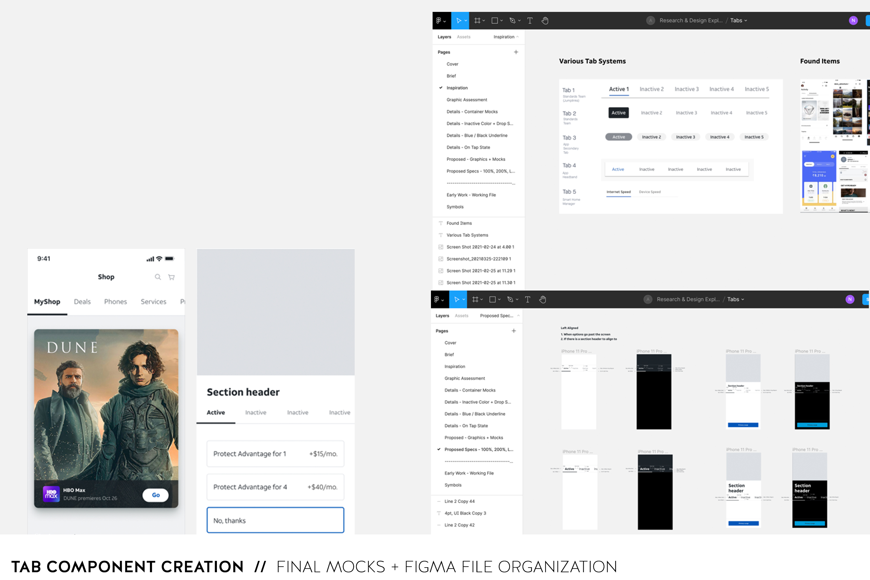
Design System - Tab Component
Project Details: When I was looking at different components, I noticed that our tab components weren't accessibility friendly and not very flexible among different uses. It appeared to me as an opportunity to create a simplified component that could be flexible. I brought it up that we may want to take a look at this and see if we can do better. I created why statements, goals, conducted audits, analysis, and research. I brought the team together to get feedback and input and then proceeded to mock up different visual options and document positives and negatives and when we might want to use this component. My advice was to not overuse this component. After the team was good with the proposal, I created a responsive component in Sketch and Figma for all to use.
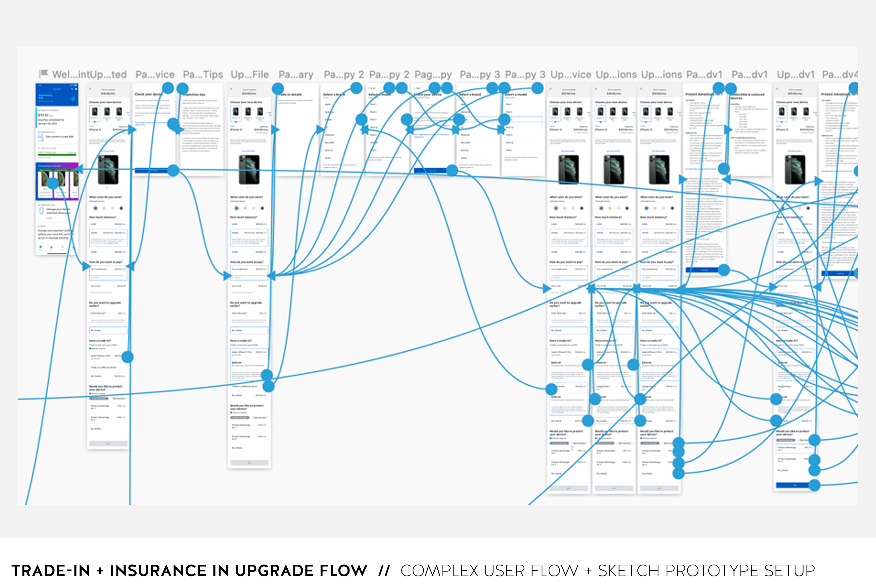
Trade-in, Insurance, + Upgrade Flow
Project Details: The upgrade flow already had a pretty robust information architecture structure and visual design. Instead of redesigning the experience, I was asked how can you make this work in the existing experience. When looking at the trade-in architecture, I recommended bringing in the name of the user and their phone details as well as an option to trade-in a different device. Someone could have an old phone that they might want to trade-in versus the phone on file because they want to pass that phone to someone else.
If the user was to tap on their phone on file, a drawer would open explaining the price shown is valid only if the phone is in good condition as well as other legal conditions. If the user selects to continue versus abort, the price would change in real-time in the top header of the main flow and the user's phone would be selected.
The trade-in a different device selection works the same but we take you through a phone selection process.
The insurance option lives under the trade-in option on the main flow and you are given two categories that host options. They are Advantage and Basic. We used a tab system (that helped bring to my attention that we might want to change the look) and displayed the options below. We did a test with users to get their feedback on what they thought about the Advantage and Basic options as well as the words Advantage and Basic. What does that mean to them? Users felt basic meant the minimal insurance and good for people who rarely have problems with their phone and advantage is more coverage for people who are more prone to phone problems. I found that interesting.
Once the user tapped on a selection, a drawer would open with the specifics of the plan. If they decided to continue versus abort, they would be taken back to the main flow with the selection highlighted and the price changed in real-time. This was designed this way due to having to display a lot of information and we wanted to keep the main flow simple with showing price changes and selections only.